Jewelry Product Photography: The Four Shots Every Listing Needs (and How to Get Them Without a Studio)
Jewelry is the hardest product category to photograph: tiny, reflective, and unforgiving of color casts. This guide covers the four shots a listing actually needs, the lighting and surfaces that make metal read true, a phone workflow that works, and where AI product photography genuinely helps versus where it invents details that cause returns.
Key takeaways
- Jewelry needs four shots, not one: a clean cutout on a neutral background for marketplaces, a macro that proves the finish and stone setting, a scale shot that shows size on a hand or neck, and one styled lifestyle image that sets the mood.
- Most jewelry photos fail on color, not composition. Gold shot under cool light reads brassy or green, silver under warm light reads yellow. Fix the light before you touch anything in editing.
- Deep, matte surfaces (velvet, slate, dark wood) make metal read as metal because they kill reflections and give the eye something to compare against. Glossy white acrylic does the opposite.
- AI product photography works for jewelry when it reconstructs from your real photos and is checked against them. It fails when it is allowed to invent: a stone count, a clasp, or a prong that was never there is a return waiting to happen.
- Google Merchant Center has explicit image rules (neutral background, minimum size, no promotional overlays). Shoot the cutout to those rules first and style everything else around it.
Why jewelry is the hardest category to photograph
Every product category has one thing that makes it difficult. Apparel has fit. Furniture has scale. Jewelry has all of it at once, in an object the size of a coin.
Three problems stack up. The piece is tiny, so any camera shake or focus miss is magnified. It is reflective, so the camera sees the room, the photographer, and the light source mirrored in every polished surface. And it is judged on color with unusual precision: a shopper knows what 14k gold looks like, and if your photo reads even slightly green or brassy they will assume the piece is cheap, not that your white balance was off.
Most jewelry photos that fail online fail on the third problem. Composition is forgiving. Color is not.
The four shots every listing needs
Skip the idea of shooting twenty angles. Four shots, done properly, do the work.
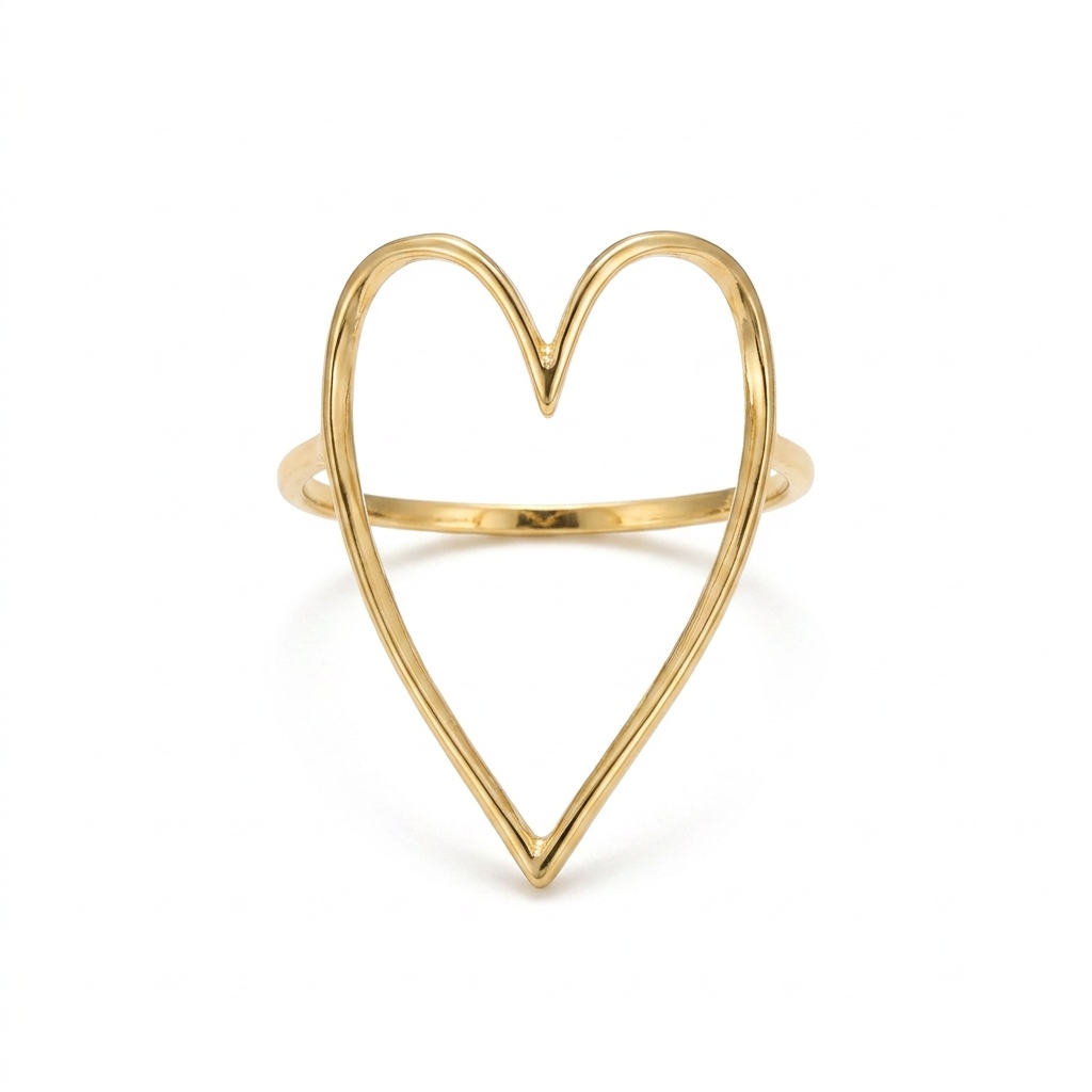
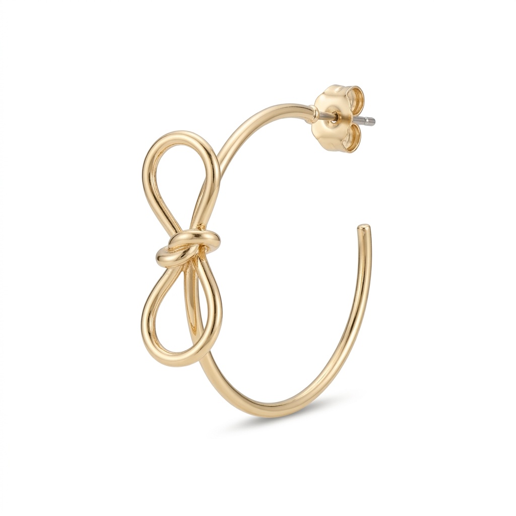
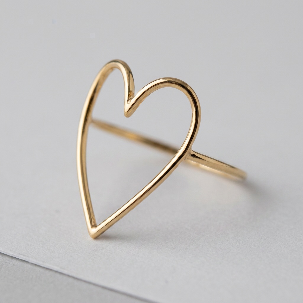
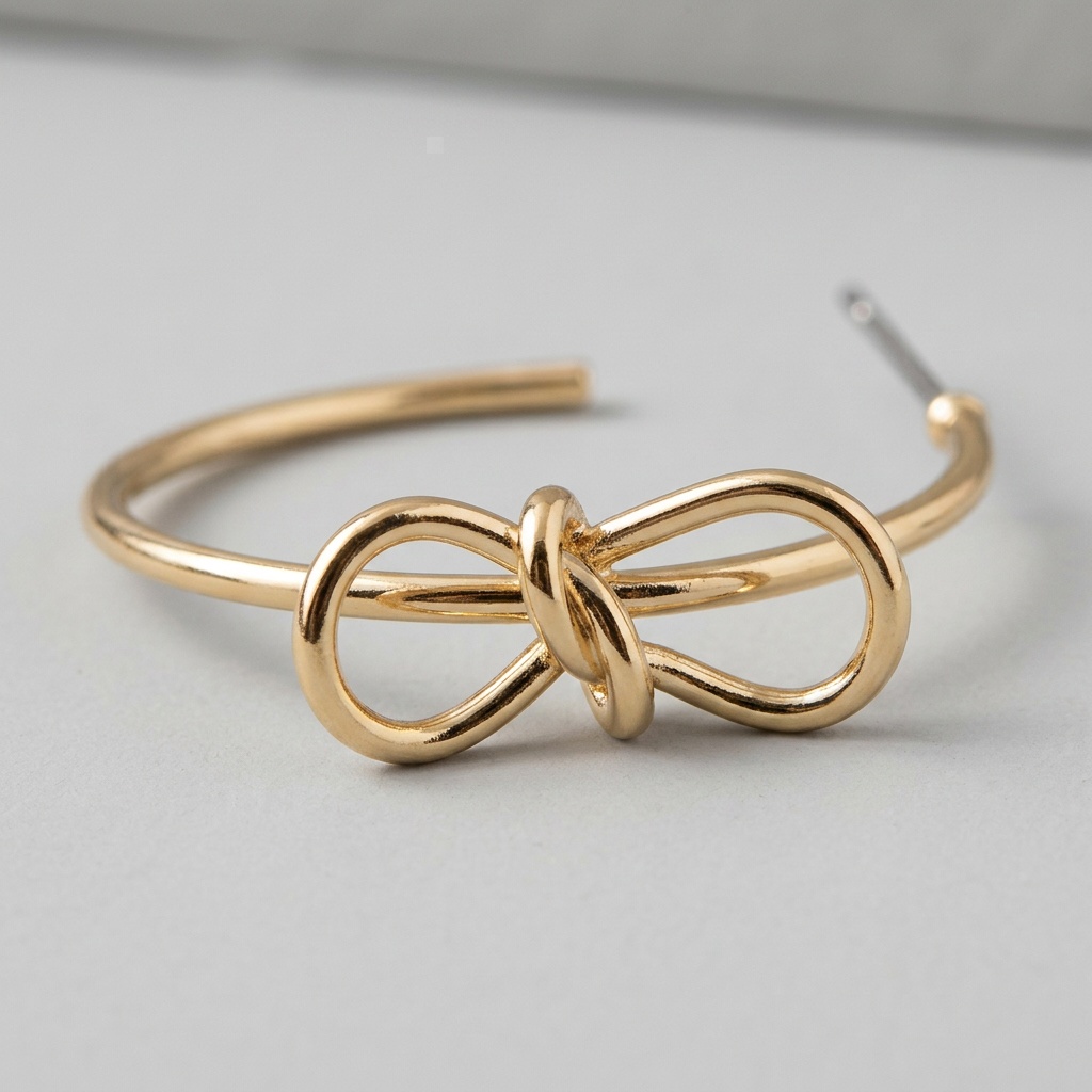
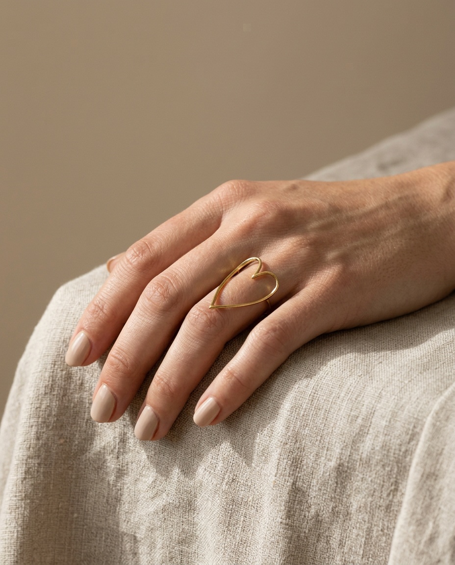
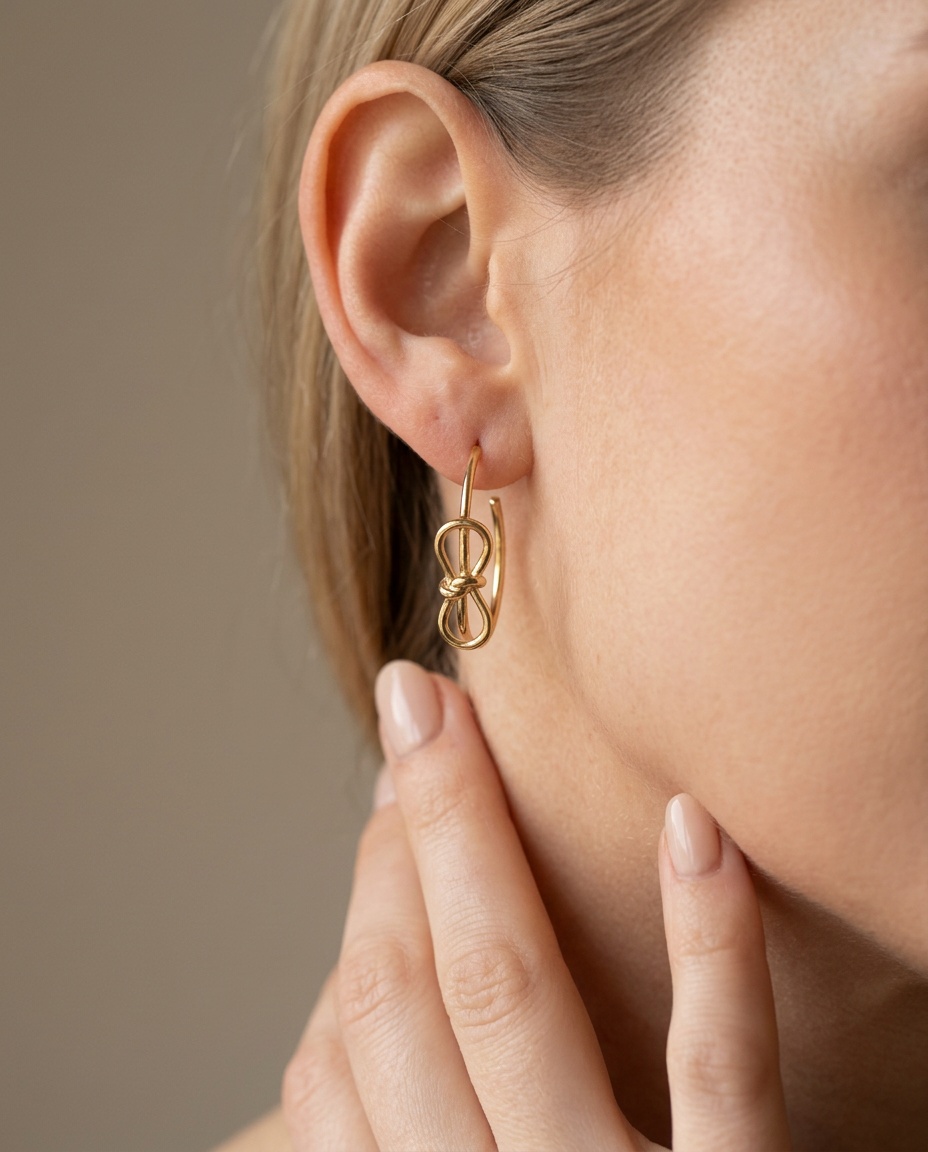
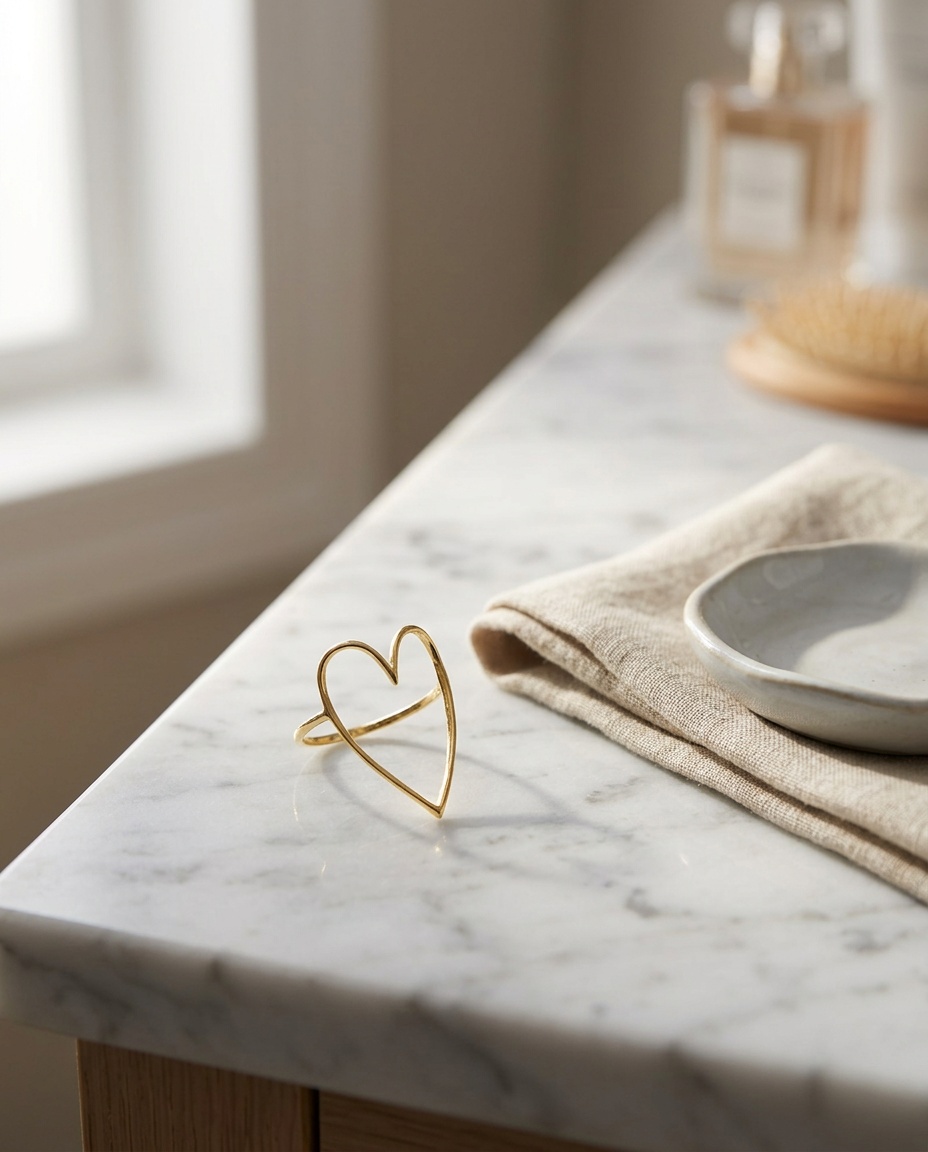
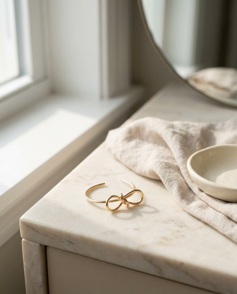
The examples under each shot are two pieces from a boutique on our platform, a gold heart cut-out ring and a pair of bow hoop earrings. Nothing below was photographed. Every image was rendered with Nano Banana 2 from the boutique's own catalogue photos, three for the ring and four for the hoops, using the same camera and the same fidelity rules our studio applies: the exact piece, no invented stones or parts, no text in the frame, and no face on the product-page shots.
1. The clean cutout
A single piece on a plain white or very light neutral background, evenly lit, no shadows crossing the product, no props. This is the image marketplaces want, the image Google Shopping will show, and the image that becomes your main product photo. Google Merchant Center is explicit about it: a neutral background, a minimum image size, no promotional text or watermarks. Shoot this first and shoot it to those rules, because every other image can be styled but this one has to comply.
2. The macro
A tight shot of the setting, the finish, the engraving, or the clasp. This is the photo that answers "is it well made?" without a word of copy. If your piece has a hammered texture, a bezel setting, a pave band, this is where it shows. Fill the frame with the detail and let the rest fall out of focus.
3. The scale shot
A ring on a hand, a pendant at the collarbone, a hoop on an ear. Size is the most common jewelry return reason, and a photo with a body in it resolves it faster than any measurement table. If you cannot shoot on a person, use a reference object and put the millimeter measurements in the copy as well.
4. The lifestyle image
One styled shot that sets the mood: the ring on a velvet cushion, the necklace on a slate tile beside a candle, the earrings on a book page in afternoon light. This image sells the feeling. You only need one, but it should be genuinely good.
Lighting: fix the color before anything else
Jewelry photography lighting comes down to two rules.
Diffuse the light. Direct light creates hard specular highlights that blow out to pure white and hide the metal's actual texture. A light tent, a sheet of tracing paper over a lamp, or a north-facing window on an overcast day all work. You want large, soft light sources so reflections become gentle gradients rather than white spots.
Match the light to the metal. Gold wants warm-neutral light; under cool daylight LEDs it drifts brassy or green. Silver and white gold want clean neutral light; under warm bulbs they turn yellow and look like cheap plating. Set your camera's white balance manually against a grey card or a white piece of paper in the same light, and do not trust auto mode, which will try to neutralize the very warmth that makes gold look like gold.
Surfaces and backgrounds that make metal read as metal
The reason so much jewelry photography looks flat is glossy backgrounds. A shiny white acrylic sheet reflects the metal back at itself and gives the eye nothing to compare against.
Deep, matte surfaces do the opposite. Velvet absorbs stray light so the metal is the brightest thing in the frame. Slate and unpolished stone add texture without competing. Dark oiled wood gives warmth that flatters gold. Charcoal linen works for silver. The common thread is contrast: the surface should be darker and duller than the piece, so every highlight belongs to the jewelry.
For the clean cutout, ignore all of this and use white. For the other three shots, a small kit of velvet, slate, and wood covers most catalogs.
A phone workflow that actually works
You do not need a camera body. A recent phone with these habits produces marketplace-ready jewelry photos.
- Use the main lens, not the ultrawide, and step back rather than zooming in with a digital crop. Digital zoom destroys the fine detail that jewelry lives on.
- Tap to focus on the most important detail (the stone, the clasp) and lock exposure. Lower the exposure slightly; recovering shadows is easy, recovering blown highlights on metal is impossible.
- Shoot in the highest quality setting your phone offers, and turn off any beauty or scene-enhancement mode. Those modes smooth texture, which is the opposite of what you want.
- Use a small tripod or lean the phone against something solid. Any movement at macro distance is a blurry photo.
- Shoot more than you need of the macro. Focus stacking happens in your head: pick the frame where the detail you care about is sharpest.
Twenty jewelry photography ideas, by piece
Product photography ideas for jewelry tend to work best when they respond to the piece rather than a general trend.
Rings: on a velvet ring cushion; balanced on its edge on slate; stacked with two others to show how it layers; on a hand holding a coffee cup; in a shallow bowl of dried flowers.
Necklaces: laid in an S curve on linen; hanging from a wooden peg so the pendant catches light; on the collarbone with the model turned slightly away; coiled in a small ceramic dish; beside its gift box, lid open.
Earrings: on a pair of earring stands against a dark wall; one on an ear, the other held in fingers; laid on a book page; pinned through a folded card with your logo; catching a single shaft of window light.
Bracelets and bangles: stacked on a wrist holding a glass; laid in a circle on stone; draped over a small branch; on a wooden hand form; in motion, slightly blurred, the only intentional blur in the set.
Where AI product photography helps, and where it fabricates
AI product photography has changed the economics of the lifestyle shot. Instead of buying velvet, slate, and a light tent for one ring, you can take the clean cutout you already have and place the piece into a lit, styled scene in under a minute. For a store with two hundred SKUs, that is the difference between styled photography for the top ten pieces and styled photography for all of them.
The catch is specific to jewelry. An AI model that is allowed to imagine will imagine a plausible ring, not your ring. The stone count changes. A four-prong setting becomes six. A lobster clasp becomes a spring ring. The chain links get thicker. None of these are visible at thumbnail size and every one of them is a return, or worse, a dispute, when the real piece arrives.
The rule that separates a usable tool from a dangerous one: it must reconstruct the piece from your real photographs, never invent a side or a detail it cannot see in them. Our own Photo Studio at Obsess AI is built on exactly that constraint, which is why it asks for more reference angles before it shoots rather than filling gaps with guesses. Whatever tool you use, run the same check before publishing any AI jewelry image: put it beside your reference photo and count. Stones, prongs, links, clasp type, metal tone. If anything differs, throw it out.
Used that way, the four-shot framework becomes cheaper, not looser. You still shoot the cutout, the macro, and the scale shot yourself, because those are the images of record. AI earns its place on the fourth shot, the lifestyle image, where the scene is the point and the piece is verified against the cutout it came from.
Marketplace and search requirements you cannot style around
Two sets of rules sit underneath all of this.
Google Merchant Center specifies what a product image must be for Shopping listings: the product on a plain background, above minimum dimensions, without promotional overlays or watermarks. A beautifully styled lifestyle shot submitted as the main image gets disapproved. The cutout goes in the feed; the styled images go on the product page.
Google Images ranks images on their own terms, and jewelry stores get real traffic from image search. Descriptive file names, alt text that says what the piece is rather than "IMG_2041", and Product structured data that points at the image all help. The schema.org Product type has an image property for exactly this; if your theme or app is writing product schema, make sure the images you care about are in it.
The checklist
Before a piece goes live, the listing has a clean cutout on a neutral background that meets Merchant Center rules, a macro that shows the setting or finish, a scale shot on a body or beside a reference, and one styled lifestyle image. The white balance was set for the metal, not left on auto. Any AI-generated image was checked against the reference photo for stone count, setting, clasp, and tone. The file names and alt text describe the piece. The measurements are in the copy. Do that for every SKU and the returns column gets shorter.
Frequently Asked Questions
How many photos does a jewelry listing need?
Four covers almost every case: a clean cutout on white or light neutral for marketplaces and the main product image, a macro of the finish and setting so a buyer can see quality, a scale shot on a hand, wrist, or neck so they can judge size, and one styled lifestyle image. Add a second angle for pieces with a distinctive back or clasp. Beyond that, more photos rarely change the decision; better ones do.
What is the best background for jewelry photography?
For the main image, a plain white or very light neutral background, because that is what marketplaces and Google Shopping expect and it isolates the piece. For everything else, deep matte surfaces work best: velvet, slate, unpolished stone, dark wood. They absorb stray reflections so the metal itself is the brightest, most detailed thing in the frame. Avoid glossy acrylic and mirrors unless you have studio lighting to control what they reflect.
Can AI generate jewelry product photos?
Yes, and jewelry is where the difference between good and bad AI photography is most visible. A good tool reconstructs the exact piece from the photos you already have and places it into a new scene and light; a bad one imagines a plausible ring that is not yours. Before publishing any AI jewelry image, count the stones, check the clasp, the prong shape, the chain link style, and the metal tone against your reference photo. If anything differs, do not use it.
How do I show the size of a ring or pendant in a photo?
Put it on a body. A ring on a hand, a pendant at the collarbone, earrings on an ear give the buyer a reference they already understand. If you cannot shoot on a model, photograph the piece next to a familiar object of known size and state the measurements in millimeters in the listing copy as well. Size uncertainty is one of the most common reasons jewelry gets returned.
Related Articles
Keep exploring
Go deeper on the topics in this article with related guides, free tools, industry playbooks, and competitor comparisons.
Related guides
Free tools
For your industry
How we compare
Sources & references
Primary documentation referenced for the technical claims on this page. We do not link out to competitor products or affiliate content; these are the standards bodies and platform docs the guidance is built against.
- Google Merchant Center: image link [image_link] specification ↗The official requirements for product images in Shopping listings, including background, minimum dimensions, and the prohibition on promotional text and watermarks.
- Google Search Central: Google Images best practices ↗How Google discovers, indexes, and ranks images, including file names, alt text, page context, and structured data.
- Schema.org: Product ↗The Product type and its image property, used by search engines to associate product images with structured product data.
Ready to Automate Your Content Marketing?
Let Obsess AI write SEO-optimized blog posts for your Shopify store.