Photos and videoChanges your store after your OK
Shoot look photos for a collection
Your products worn or used by one of your people, on the backdrop you pick, placed in each product's gallery.
Ready-made jobs for a Shopify store: product pages, collections, phone fixes, search listings, photos and video. Pick one, fill in what it asks, and it plans the work and shows you what it will change before anything goes live.
Free to explore · $10 per 30 days
The first row in the app, Found on your store, is chosen from your store: the worst problems from its latest check, and what your catalogue is missing. Each card opens its workflow already filled in.
Every workflow in the app, in its own words, with what it changes in the App Store version. The ones with a guide link to it.
Your products worn or used by one of your people, on the backdrop you pick, placed in each product's gallery.
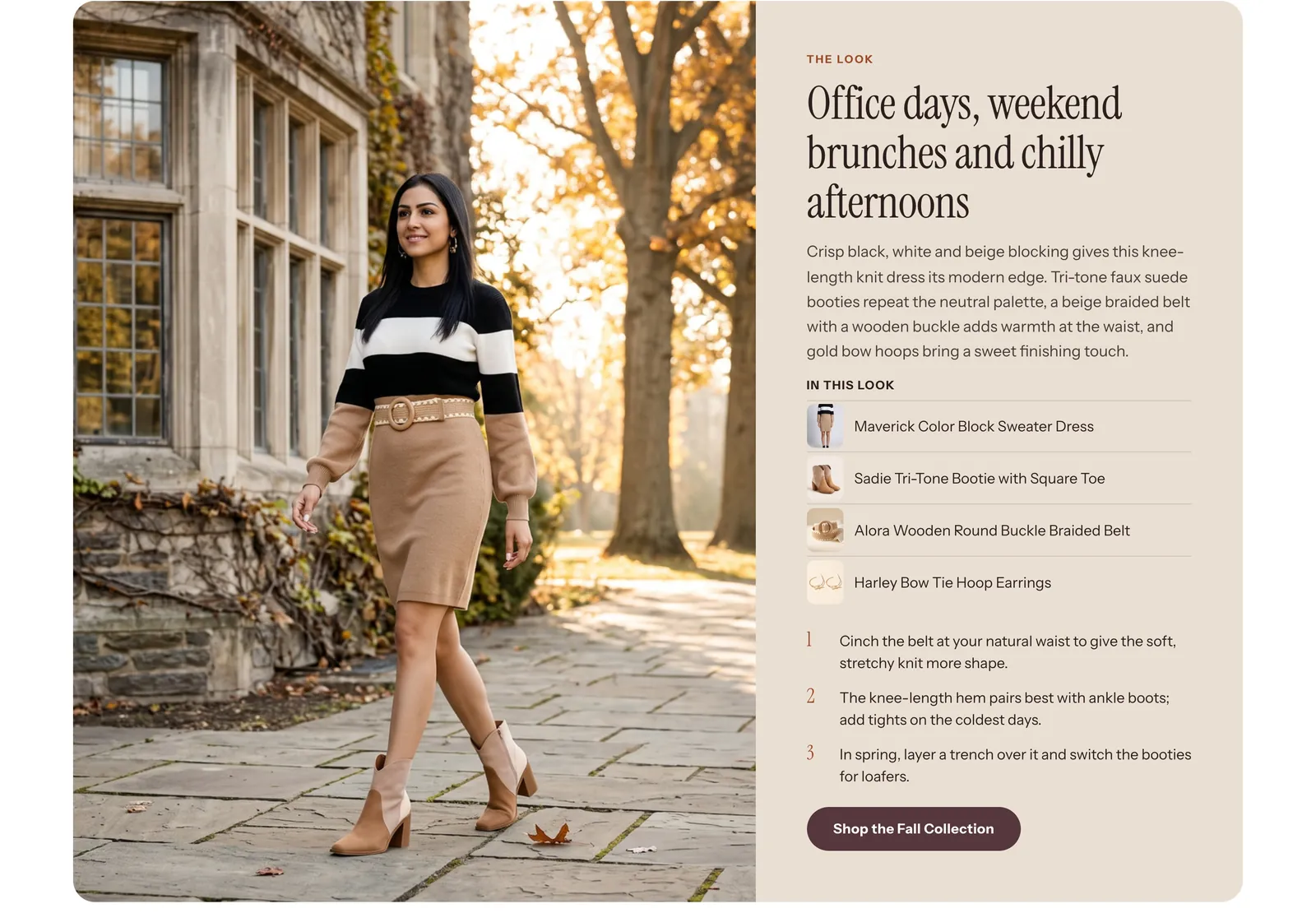 Real example
Each product gets the pieces that finish its outfit, shown by Search & Discovery as Complete the look.
Read the guide : Complete the lookA few short ads for the season made from your own products, for the platforms you post on, ready to download.
A new picture for the top of your home page, made for the season or mood you describe and shown in your hero, with the steps to put it there.
A short clip of one product, checked for the right product, added to its gallery.
A person of your own for your photos: trained from photos you give, or picked from ready-made people.
New titles and descriptions written only from what each product and your sheet say, checked by you product by product.
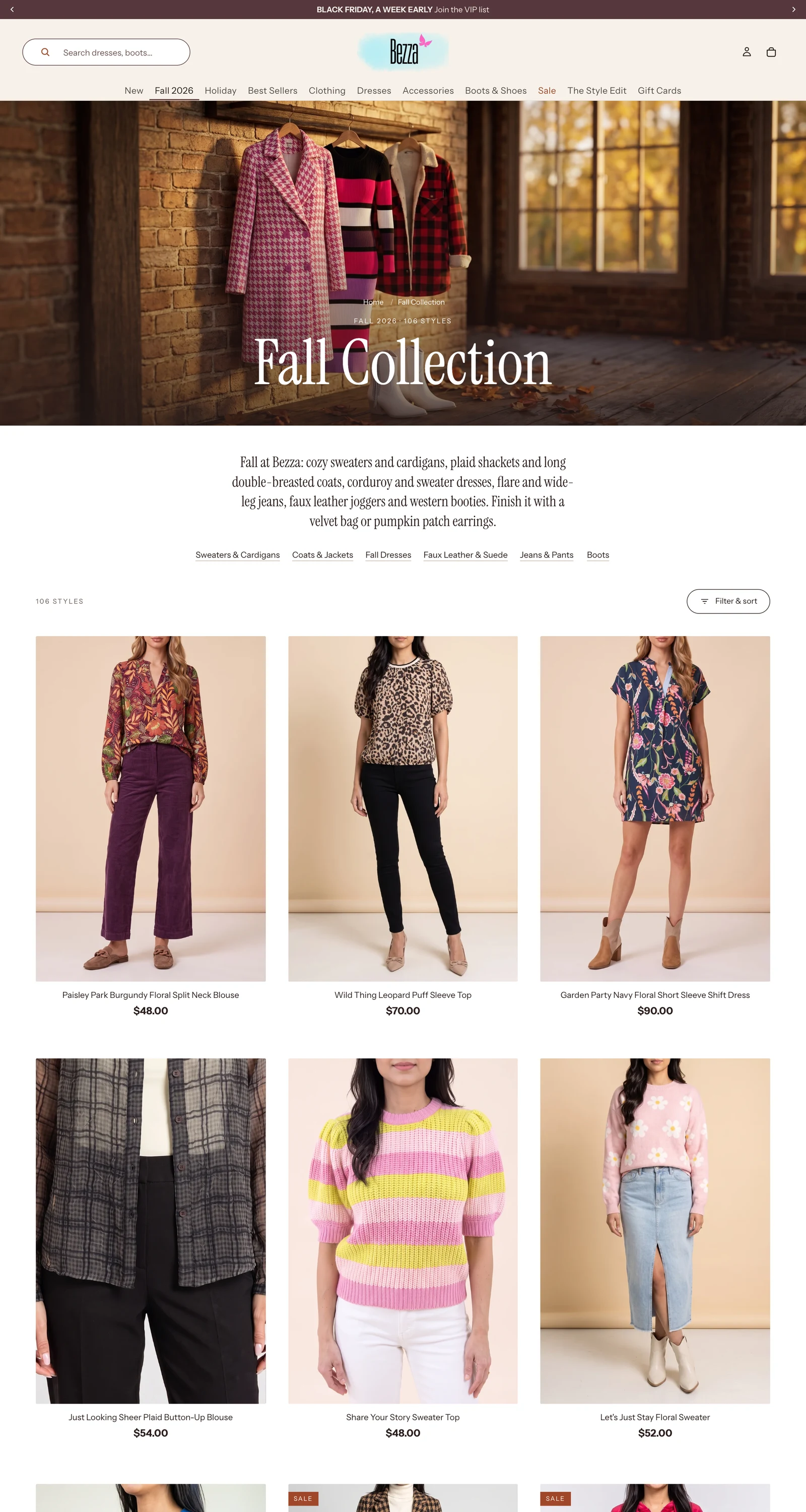 Real example
A new collection made from products or a tag, with its words and image, on your menu and home page if you want it there.
Read the guide : Launch a collectionDescriptions and search listings for your collections, starting with the ones that show nothing in Google.
Tags and product fields made consistent across the products you pick, so filters and collections find them.
Your main menu checked for broken links, empty collections and lists too long for a phone, and put right.
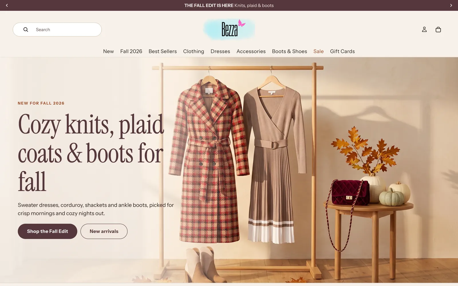 Real example
Your home page dressed for the season as a design you add to it, built for phones first, easy to take down when it is over.
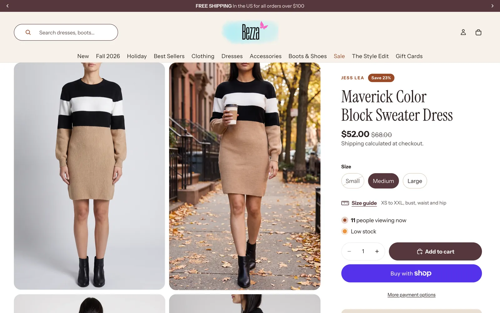 Real example
A buy box a shopper trusts on a phone: price, stock, delivery and returns beside Add to cart, and a button a thumb can hit.
Read the guide : Make the product page sellDelivery cost and time, returns, payment options and reviews stated where the shopper decides, not only in the footer.
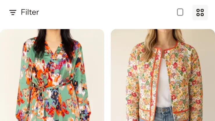 Real example
Product cards that show price, colour and stock at a glance, and a grid and filters that work with one thumb.
Read the guide : A collection page that browses wellOn a long product page, a slim bar with the price and Add to cart stays at the bottom of a phone screen once the real button scrolls away.
Their page beside yours at the same width, what they show that you do not, and the gaps worth closing mocked up for you.
Search titles and descriptions for your products, starting with those that have none, each short enough for Google to show whole.
What people search for that your collection sells, measured, and its description and listing written to match.
Empty collections, test pages and thin near-duplicates found and hidden from search engines, each on its own card.
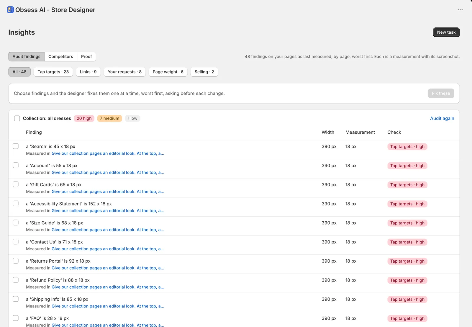 Real example
Every serious phone problem on the page you pick fixed, measured before and after, and nothing else touched.
Read the guide : Fix what is broken on phonesContrast, text size, tap targets, image descriptions and focus states checked on the page you pick, and the failures fixed in your theme's own colours where one change fixes many.
Heavy images, pictures that make the page jump, and oversized scripts found and trimmed where the theme allows.
Home, collection and product audited at phone and desktop widths, ranked worst first, with a review link your client can open.
One board of the theme's colours, type sizes, buttons and spacing as they really render, for a client, a new designer, or a brief.
Every page the working copy changed, rendered at phone and desktop widths, with Theme Check and anything that got worse named.
A frame from your Figma file made as a design you add to your theme, in your theme's own colours and fonts.
A task's changed theme files as a pull request on your GitHub repo, with what each change measured.
Turn any task into a workflow and run it again with one press. It keeps what you asked and the answers you gave. Up to 20 per store; when you save one more, the oldest goes.
Saving needs a task with a request of your own in it.
Free to install. The Explore plan includes $10 of AI work to try it on your store.