Shopify mobile optimization: find and fix what breaks on phones.
Every serious phone problem on the page you pick fixed, measured before and after, and nothing else touched.
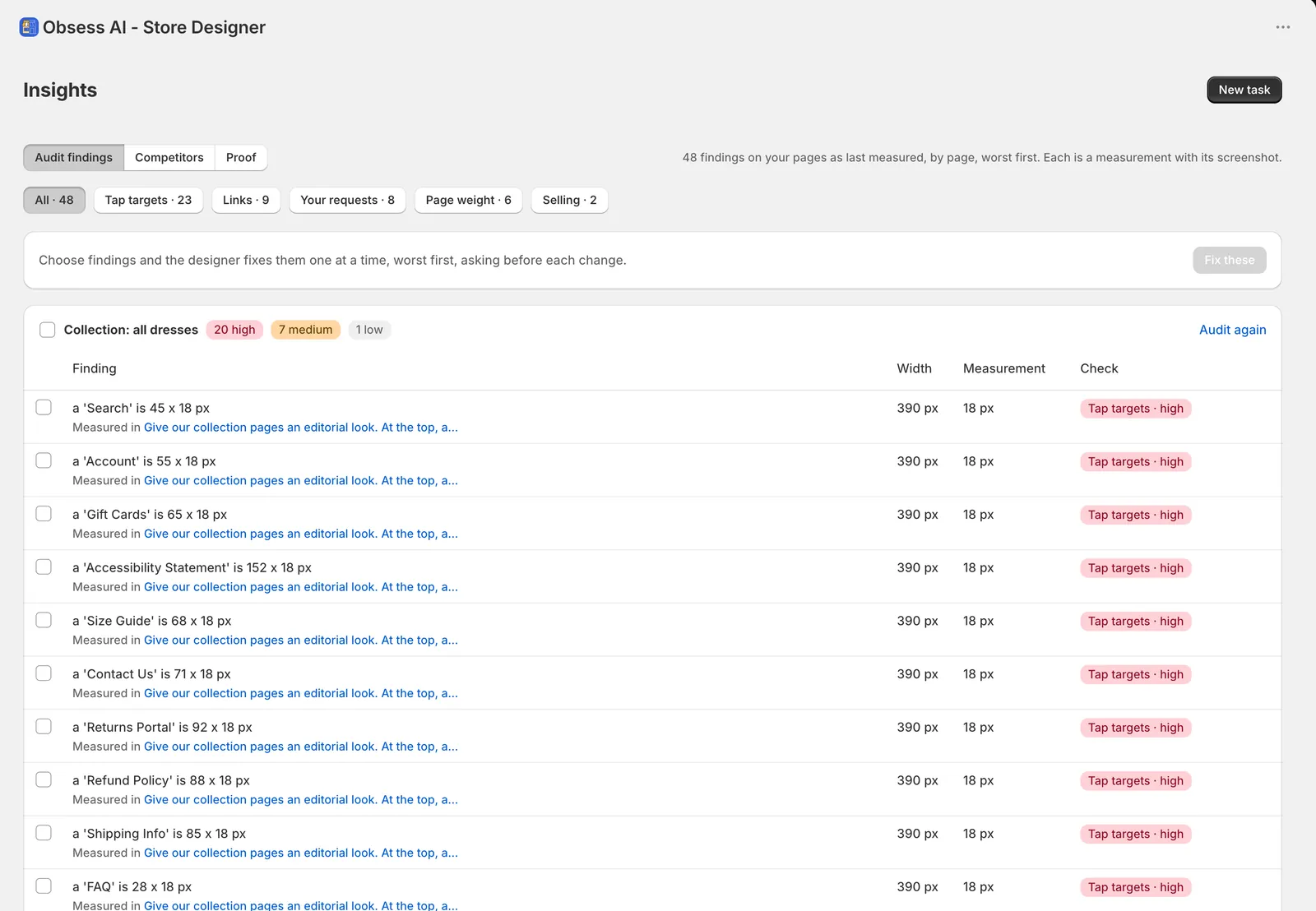
Store Designer audits the page at phone width first, then fixes only what it measured, worst first.
Free to explore. Saving needs Pay as you go, $10 per 30 days
How do I optimize my Shopify store for mobile?
- Look at each important page at phone width (390 px), not a desktop page squeezed down.
- Make every button and link big enough to tap: at least 44 px.
- Keep text large enough to read without zooming; 16 px is a common floor for body and form text.
- Remove anything wider than the screen, so the page never scrolls sideways, and anything that overlaps.
- Fix the worst problems first, and measure each fix again before you move on.
The real example
Shop Bezza’s home page, on a phone.
Before and after Shop Bezza’s Store Designer redesign. That redesign changed more than a phone fix does: this workflow changes only the problems it measures on the page you pick.


How the workflow runs
Audit first, then measured fixes.
- Audit the page at 390 px
- Rank what is broken, worst first
- Fix the serious ones with styles for your theme
- Measure each fix again
What you set up
- Which page
Then press Audit the page
What you get
- An audit at 390 px (starts with an audit)
- Fixes for measurable phone problems only (tap targets under 44 px, text too small, content wider than the screen, overlaps), worst first, each re-measured
What it changes
Adds styles to your theme
- Adds styles to your theme that fix the problems it measured on the page you pick.
- Each fix is measured again, and it asks before each change.
What it doesn’t do
- Doesn’t touch anything beyond the problems it measured on that page.
- Doesn’t rewrite your theme’s own files in the App Store version: fixes are added as styles.
- Doesn’t promise a speed score or a ranking. Load speed is a different job.
Questions
Shopify on phones, answered.
- How do I optimize my Shopify store for mobile?
- Audit each important page at phone width, then fix what is measurably broken, worst first: tap targets under 44 px, text too small to read, content wider than the screen and things that overlap.
- Is Shopify mobile friendly?
- Shopify’s current themes are built to resize for phones, but a store can still break on a phone once apps, images and custom sections are added. Small tap targets, tiny text and sideways scrolling are the common ones.
- How do I make my Shopify store mobile friendly?
- Check the page at 390 px wide, list every problem with its measurement, and fix them worst first. Store Designer does that on the page you pick and measures each fix again.
- How do I see what my Shopify store looks like on a phone?
- Open it on your own phone, switch the theme editor to its mobile view, or set your browser’s device toolbar to 390 px wide. Store Designer audits the page at 390 px for you.
- What size should tap targets and text be on mobile?
- Anything a shopper taps should be at least 44 px, and body and form text around 16 px. Store Designer flags tap targets under 44 px and text too small to read.
- Why does my Shopify store scroll sideways on mobile?
- Something on the page is wider than the screen, often an image, a table, an embed or a section with a fixed width. The audit finds what is too wide, and the fix makes it fit.
- Will it make my store faster?
- No: this workflow fixes layout problems on phones, not load speed. For speed, start with our guide to Shopify site speed. Read the site speed guide.
Related
Find what breaks on a phone.
Install Store Designer, then start with Audit the page.
Free to explore. Saving needs Pay as you go, $10 per 30 days